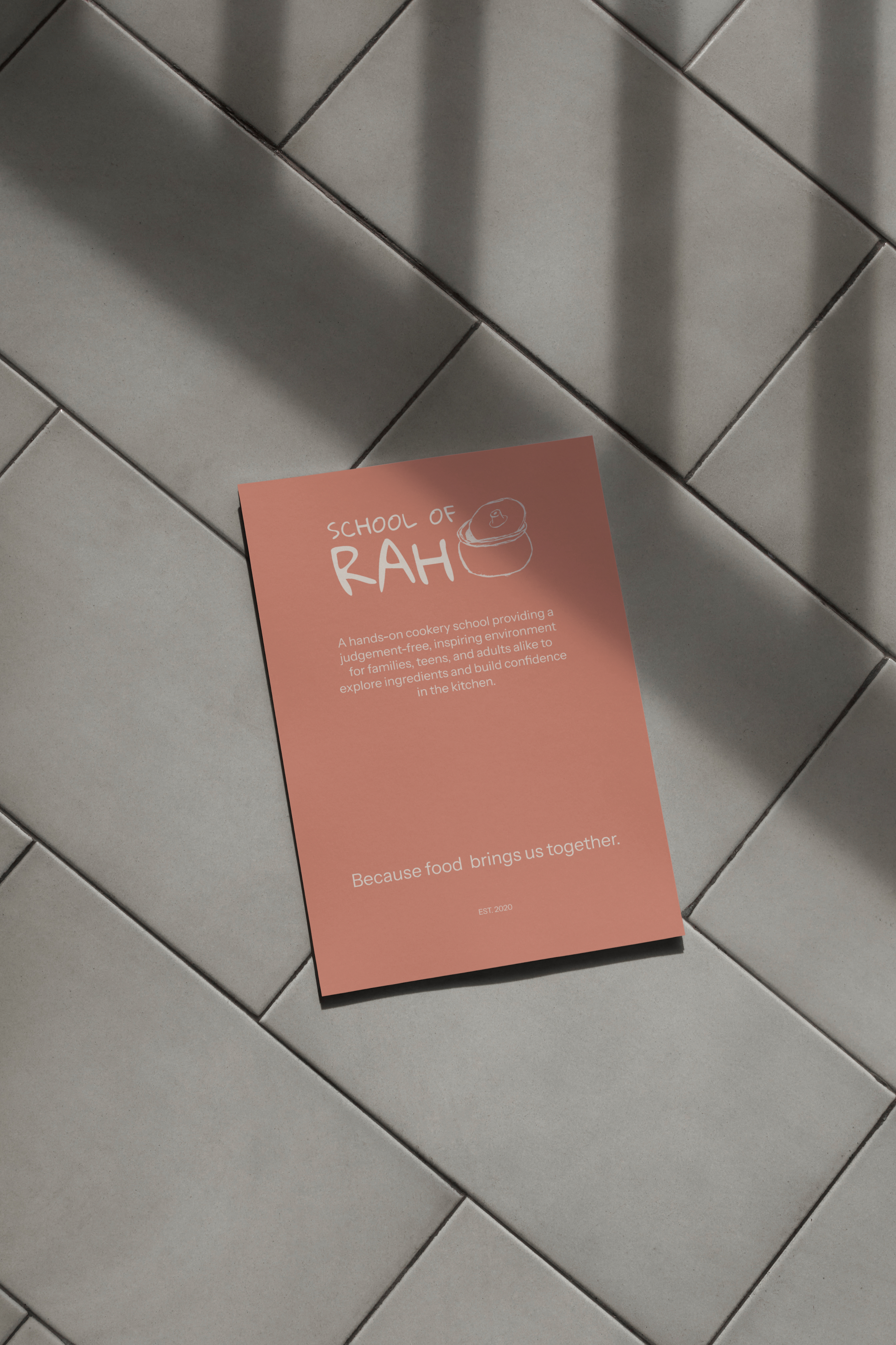
School of rah

School of Rah is a concept cooking school centred around building confidence in the kitchen and discovering new ingredients, through hands-on learning. Designed for adults, families and children, they offer classes focusing on real skills and independence, rather than perfection.
The concept was inspired by the idea that cooking is often taught through instruction or necessity, rather than experience. So, School of Rah is positioned as a welcoming place for experimentation and judgement-free learning.
The brand needed to feel approachable, tactile and human to reflect the inclusivity of the physical space. This way, it could then appeal to it's primary audience: adults looking to develop their own confidence in the kitchen or do so with their families as a shared experience.
The challenge
While the concept itself was an incredibly strong one, the brand needed to communicate several ideas clearly: that School of Rah was educational but not intimidating, professional but not overly rigid and suitable for both adults and children.
Cooking schools often present themselves as highly technical, which can feel inaccessible to beginners. School of Rah, however, focus on confidence-building, empowerment and exploration.
From a website perspective, the challenge was to make the site answer as many anticipated questions that the target audience may have around suitability for children, the curriculum, the background of the staff etc. It also needed to clearly convey the core subjects and class details in a way that is appealing. There was a lot of information to pack into the site, but the challenge was to do so without overwhelming users and creating fiction in the user's booking journey. So, it needed balance clarity with simplicity, to create an engaging and easy-to-navigate website.
The branding approach
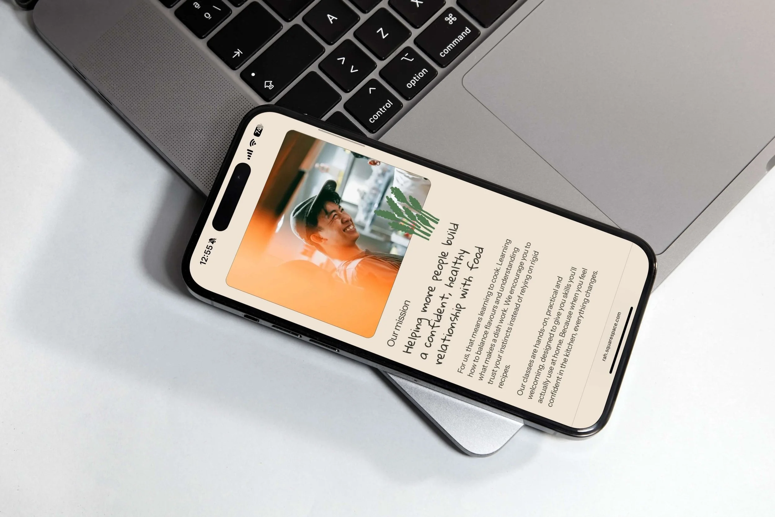
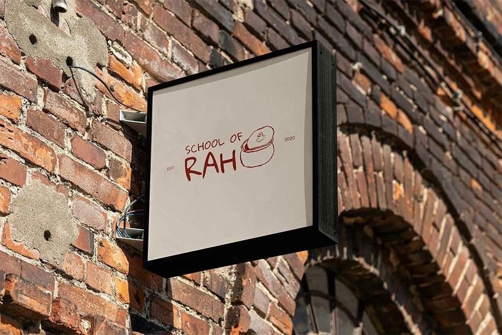
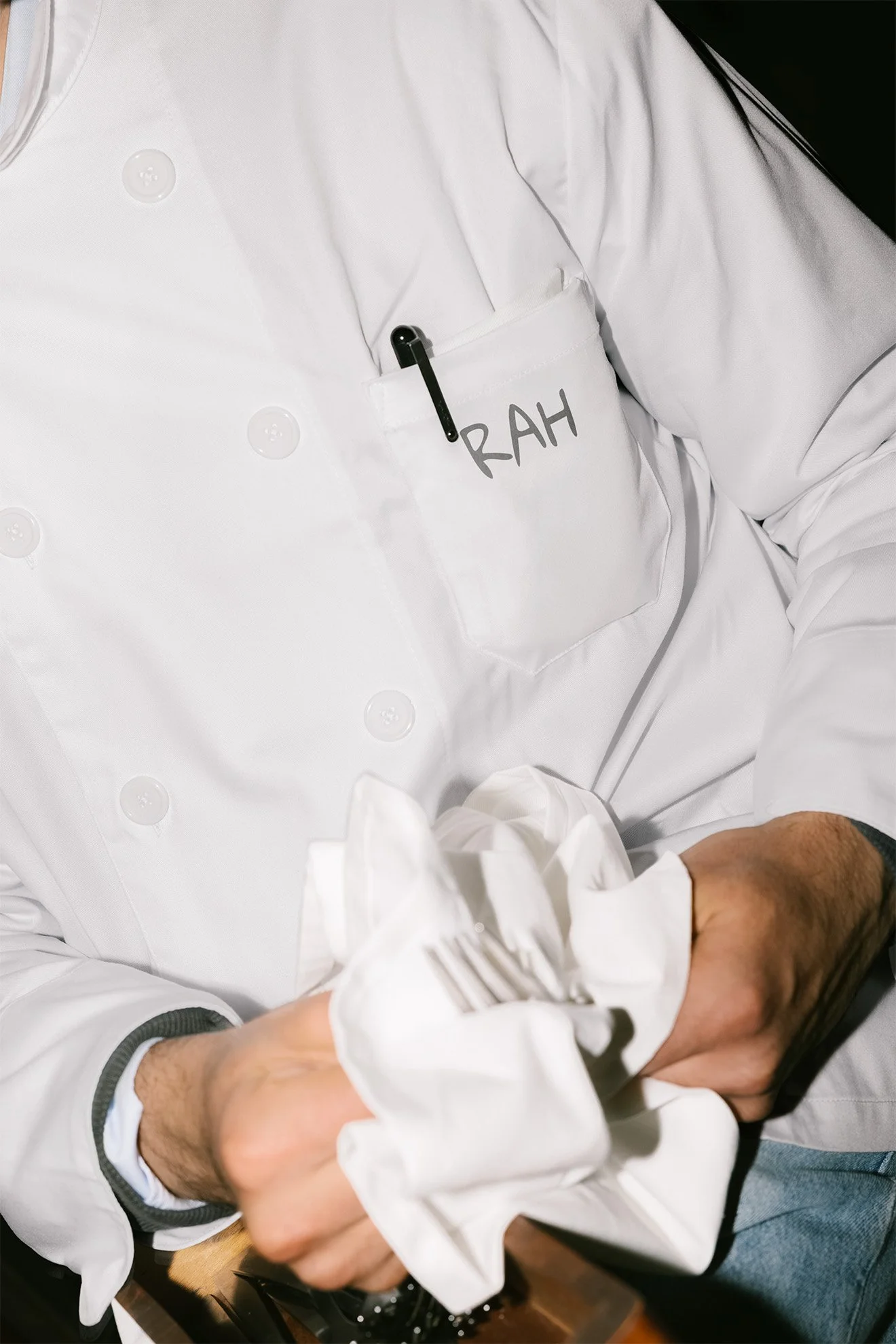
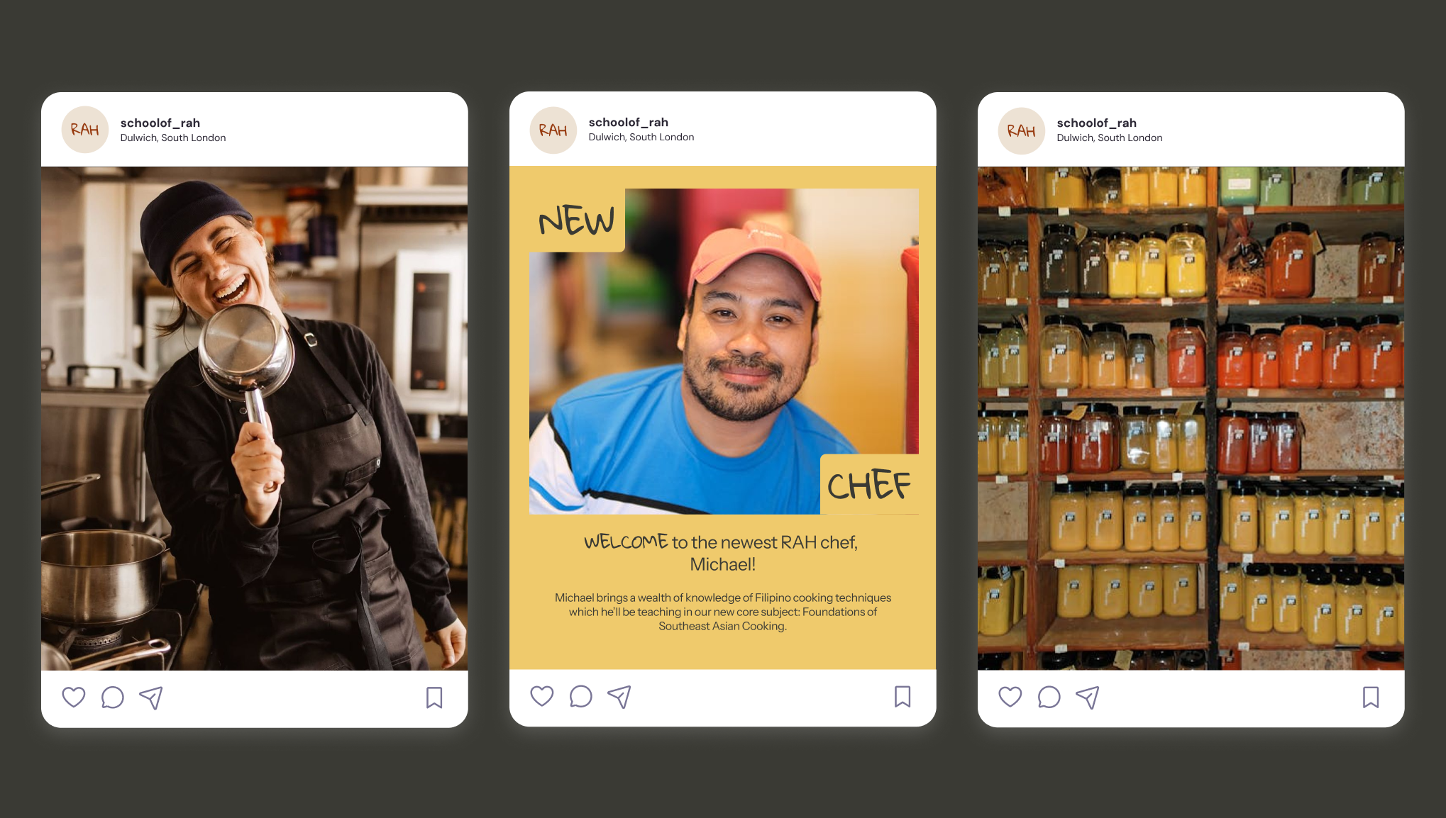
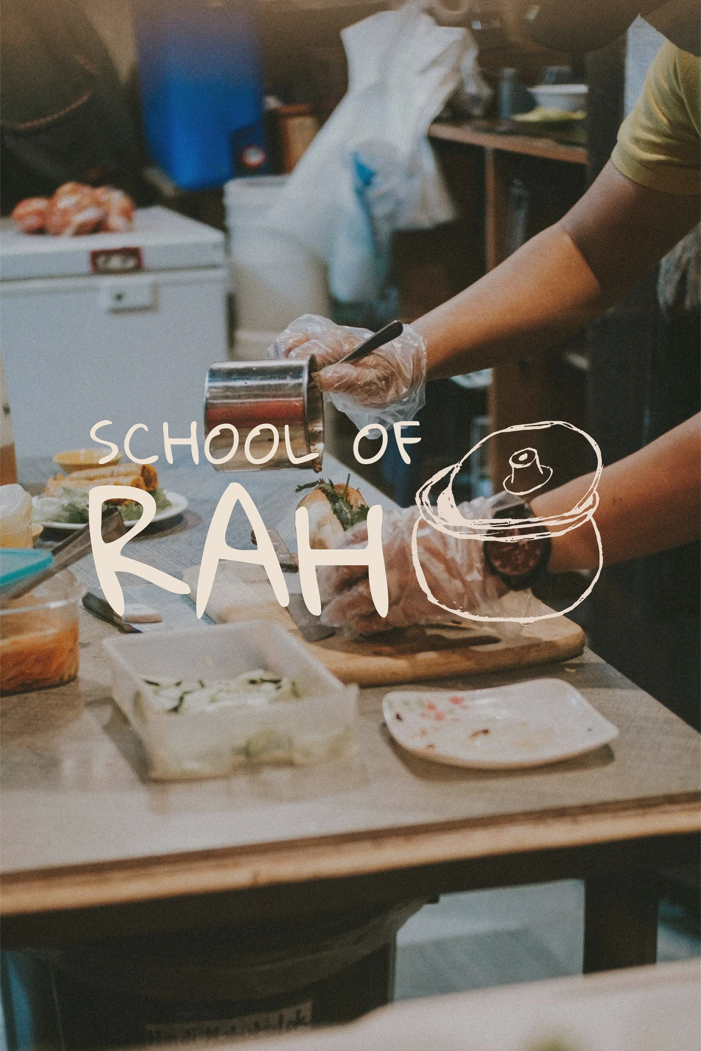
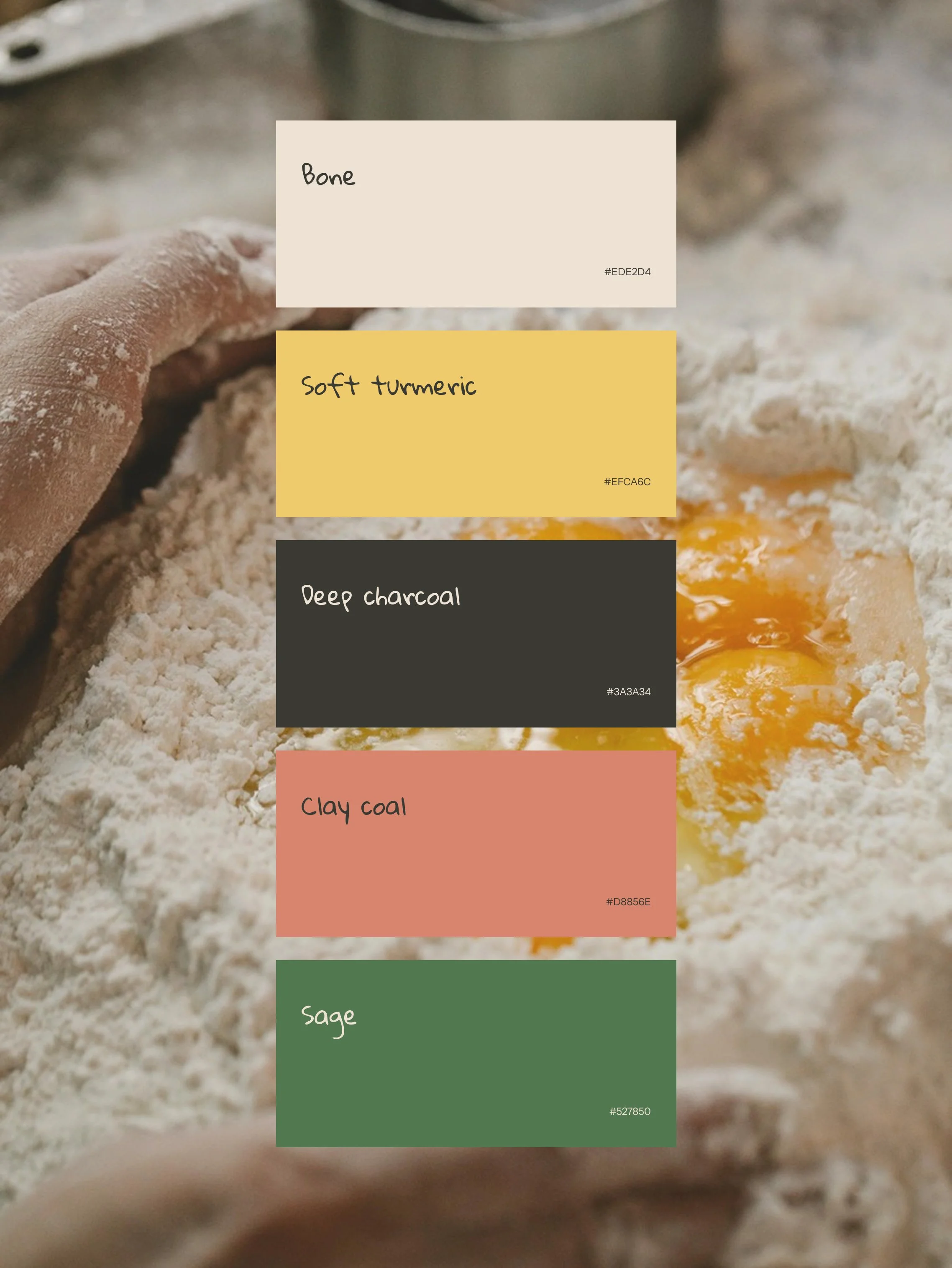
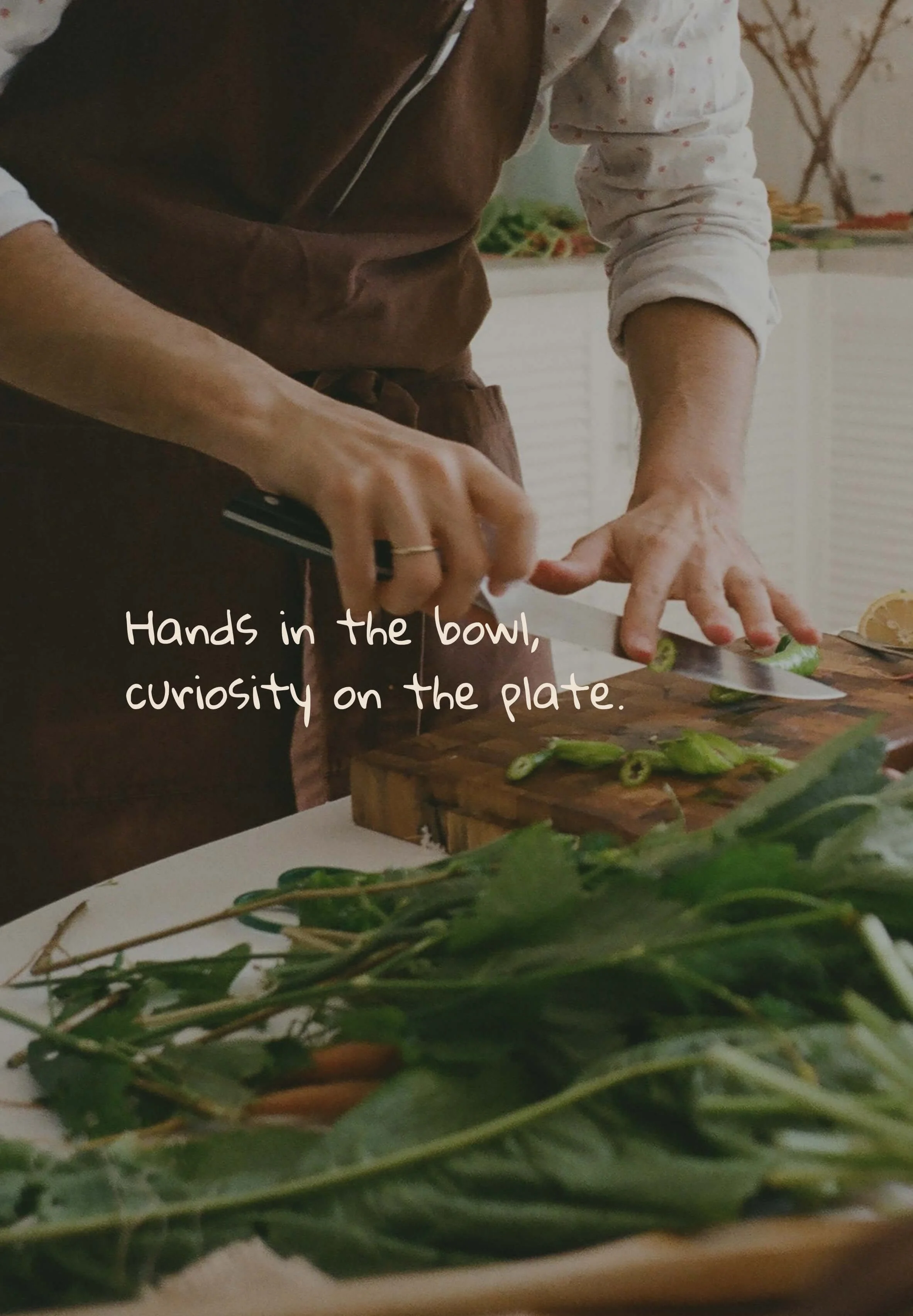
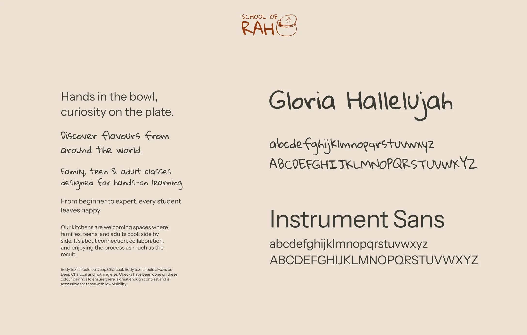
We developed the brand around tactility, expression and warmth. Rather than positioning the School as a formal culinary 'institution', the visual identity leans into approachability. We used soft edges, earthy graphics and a hand-drawn logo to create a sense of accessibility, ensuring their brand felt appealing to adults, without excluding children, who several of the classes are designed for.
A key consideration was ensuring the brand visually represented diversity. The chef trainers are from around the globe, and the classes are inspired from each of their respective countries (and more!) which needed to be weaved into the brand. The identity avoids overly polished elements often associated with culinary institutes, and instead leans into embracing a more human feel.
The overall direction aims to communicate that the School is a welcoming space where mistakes are seen as part of the process and curiosity is always encouraged.
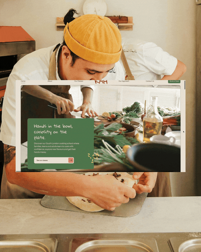
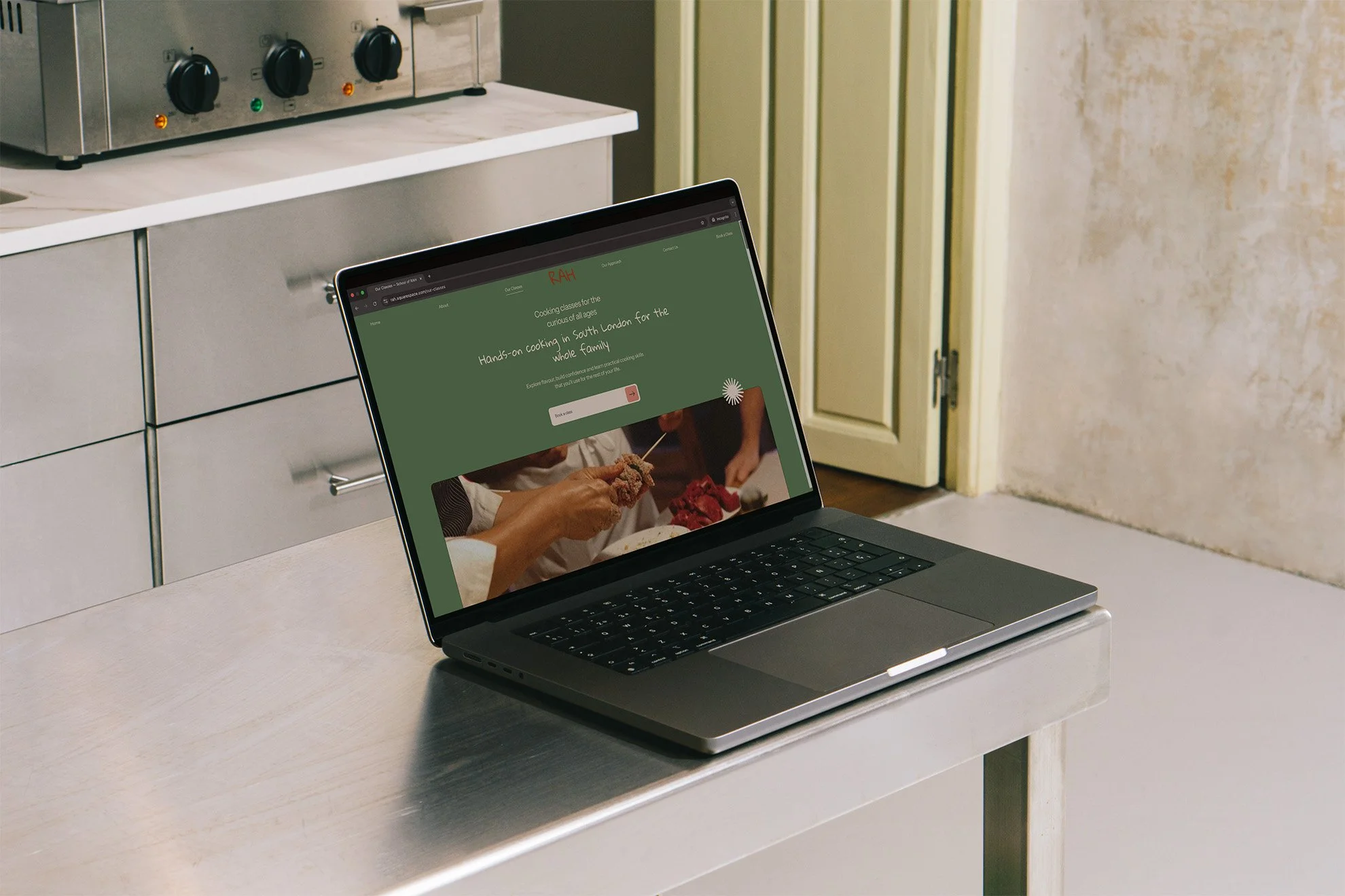
The website strategy
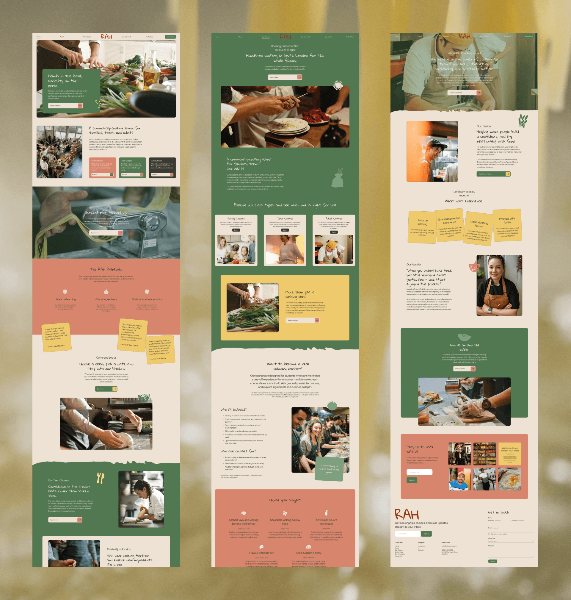
The website was designed with a strong focus on user journey and a conversion-focused UX.
Because the target audience includes both adults and parents, who would be looking for slightly different information, the structure prioritises clarity. Key questions and class details are addressed early on in the experience, helping users promptly understand what School of Rah is about and what's on offer that appeals to their needs.
We layered information carefully through the site to avoid information overwhelm. Content is broken down into scannable and digestible sections that guides users through the experience.
Strategic calls-to-action and a clear navigation ensure that users know where they are and what the next step is. Exploring classes or booking, is always easy to do, site-wide.
The goal was the create a digital experience that was on-brand, in that it reflected the nature of the school itself: supportive, intuitive and laid-back.
The result
The final concept presents School of Rah as a welcoming and inclusive scooking school built around learning through doing.
The combination of an approachable visual identity and a thoughtfully structured website helps communicate the schools values clearly. This project demonstrates how we use strategic brand design and positioning, and intentional UX design to support storytelling and conversion, for a community-driven brand bringing people together through food.